Trick of the Trade: Know Your Data
Before you go swimming, it’s important to know what you’re jumping into. So while you’re tackling your job search, it’s good to look at the data first. Know who you’re up against. Take some time before that big interview to study the stats, learn the ropes of your industry, and understand its past, present and how you can improve its future.
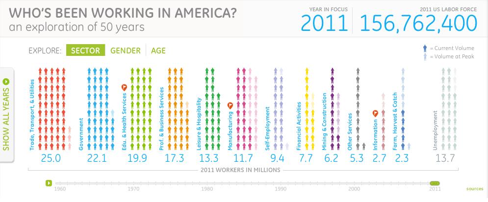
GE has gone above and beyond looking at the data by asking “Who’s been working in America?” They’ve put together a comprehensive, interactive visualization that explores the past 50 years of working in America which can help you quickly and efficiently understand some of the data. Play with this tool—you can look at it from tons of angles—by sector, age, or gender.
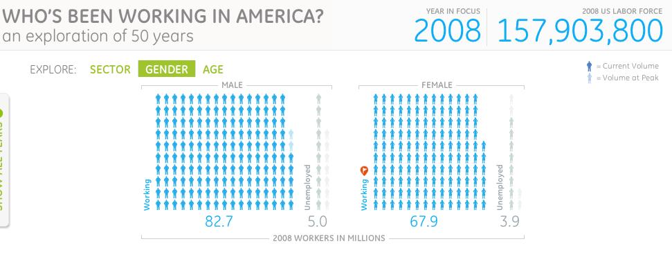
Slide the green bar across the timeline to see how roles have changed, or look at the graph of all years to show workforce growth over the past 50 years. Hover over each detail for explanations and statistics. For example, from 1960 to 2000, the ratio of working US women to men rose from 48% to 82%. In the last decade, however, it fell to 81%. This stagnation can easily be attributed to the huge rise in unemployment from 2008 to 2009 across both male and female workers.
Looking closer at the viz, it shows that women in the workforce reached its highest level in 2008, representing 42% of total American workers, but then in 2009, that figure dipped steeply when almost 2 million women left the workforce.
Now the job market has remained fortunately stable, but this visualization created by GE of the historical trends in American labor can help arm you in your search today. In the end, as long as you stay focused on the details and study the data, you’ll be one step ahead, and a resource like GE’s “Who’s Been Working in America?” doesn’t come around too often. After all, knowledge is power, and knowing all the data could empower you to land your dream job.
Submit a Comment